


Some figures on income tax
This is going to be boring. You are warned.
Normalized polynomial models for 7 countries' income tax...
...yes, yes, blah blah..
Blog, Modelling, Tax, Cost of Living, Boring
April 15th, 2015
Let's begin, shall we?
Sometime ago I was about to move elsewhere, and I was really curious where was I going to pay more in taxes. I did my calculations and stored the files for years.
In case you're not from Argentina, lately there's been a big fuss over here on the topic of income tax. People from both sides of the issue start throwing numbers, and the confused spectators don't know which side's truth to buy. Gladly, I dislike confusion and really like math, so? I decided to remove the virtual dust from my old numbers, update them and see what the hell everybody was complaining about.
THE PROCESS
First things first, I obtained a list of tax calculators and the rules they used. My seven chosen countries where: Argentina, Hong Kong, Ireland, UK, Canada, Singapore and USA.
As I have a pet AI that can crunch numerical relationships, I asked it to build a model to answer: how much would I have to pay in tax if I earn X amount of dollars?
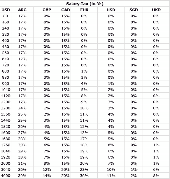
However, the AI can't learn these associations out of thin air, I needed to give it the data. So that is why I picked the previous list of tax calculators and went into the trouble of obtaining several data samples in a bracket from 80 to 4k USD. As a disclaimer I must say that it is not actually necessary to use AI to "learn" this as the rules for obtaining tax data are very well known. I get bored and I do stuff like this. However, there's a good byproduct of doing it, as it is much easier to compare "y = x" and "y = 2x" than a cascading tax procedure; and there's the bad byproduct that this is not perfect and that it is likely not to work outside of the given range (I intentionally forced over-fitting).
So I began working on this "boredom-killing" boring procedure:
- Get data from calculators.
- Use AI on data.
- Wait for results.
- Plot them like any other math function.
And I got this:
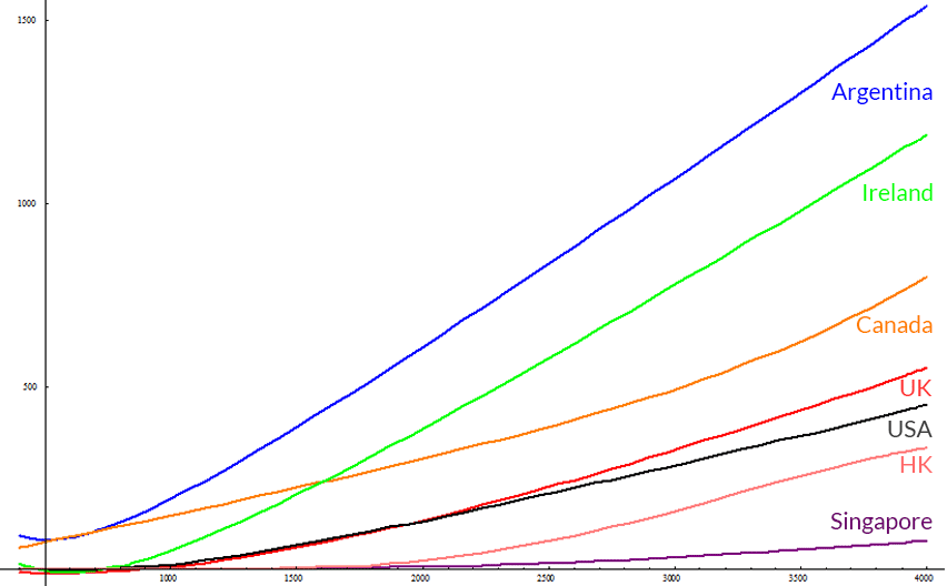
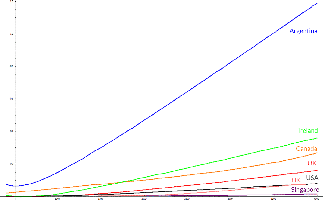
Argentina, UK, Canada, Ireland, USA, Singapore, Hong Kong
The Y axis is how much one pays in tax, the X axis is the size of your salary; both are in US dollars. You might notice Singapore as missing, but it is actually not. It's just that Singapore has really low tax on salaries, being practically zero for this range.
A really big problem with this approach is that we can't compare this figures nominally as the cost of living varies in each country, sometimes significantly.
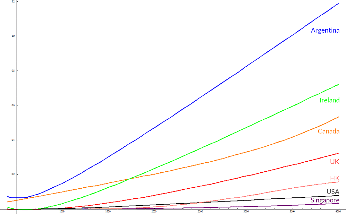
Without adding any more data, what we can do is change a little bit these functions to show us the percentage of salary they represent. Bear in mind that this will highlight the inaccuracies of this approach.
For example, Argentina's equation is: y = 0.483440531552717*x + 143056 / (36.3367415530786 + x) - 427.511202523304
So I'll just divide everything by X again: y = (0.483440531552717*x + 143056 / (36.3367415530786 + x) - 427.511202523304) / x
Doing so with every other gives us:
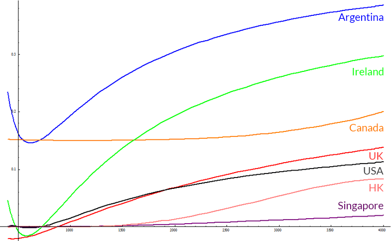
Argentina, UK, Canada, Ireland, USA, Singapore, Hong Kong
The function representing Argentina and Canada, will have a high degree of error being analyzed in this way because it is quite hard to find a polynomial that resembles a staircase without using some kind of piecewise function.
Why a staircase? Well, Argentina's tax schedule charges 17% until around 1200 USD, then it starts scaling more or less linearly. Canada does the same thing at a point between 2000-3040 USD. See for yourself.
Creating piecewise functions, i.e. defining a function as a group of functions in several intervals, would be very accurate but not as simple as a single polynomial. Technically there's several ways in which I do it, but none of them is worth mentioning here, suffice to say that piecewise I get a margin of error way below 1%.
Adding Cost of Living
This is where it gets tricky. The cost of living varies radically from individual to individual, and surely has some ?stratification? going on. People with different incomes have clustered priorities for expenditures.
I found this wonderful site called numbeo, which collects cost of living stats from different places in the world with tables for the price of common things and a statistical distribution for regular expenditures.
As a frugal person, my expenditures are very different from the common citizen; different as in low, haha. I confirmed this when making some numbers for my expenses with numbeo's data.
Being that my expenditure distribution is different from other people's I took numbeo's distribution which details categories and percentages for those categories.
For instance, in San Francisco you would spend about half of your income on rent. Numbeo lists a common rent figure of about 3k USD, then a regular income would be about 6k. The rest of the categories I fill extrapolating from rent which I consider it is the most relevant category.
Doing that with Numbeo's data yields:
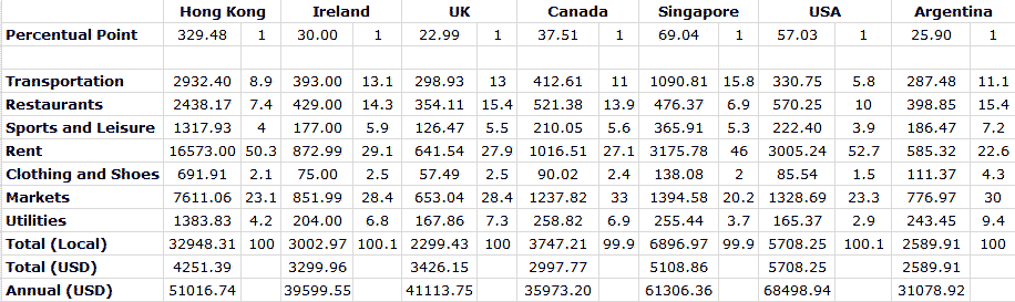
I've checked with some friends about US data, for the rest I don't have way of measuring it. Since it's not my job to elaborate detailed statistics about countries my curiosity can only take me so far.
In case you haven't noticed, there's a big issue here. This data is inclined towards expat expenditures, as no regular Argentine citizen with a head on its shoulders would spend 398.85 US dollars on Restaurants. At the dollar "blue" value that amount equals about a minimum wage. A figure of about half of the Cost of Living listed here would nicely accommodate a large chunk of the population. It might be the same case with the rest of the countries, take this with a pinch of salt.
With these constant values I can scale and normalize the previous functions. This is what we get:
Argentina, UK, Canada, Ireland, USA, Singapore, Hong Kong
Argentina's clearly the leader here. At 1.2 costs of living at about 4k USD, this is certainly not a good thing. However, we must remember that I skewed these results regarding Argentina's Cost of Living according to my more realistic expectations. It is only fair that I do so with the other countries I do not have any down-to-earth data. That being said, I'll split each of those countries cost of living by half to get another "fairer" comparison.
Argentina, UK, Canada, Ireland, USA, Singapore, Hong Kong
Now it looks bad, but not as bad as before. What's good about this is that countries with really low tax brackets do not look as good as they should. If you're a US resident you might be surprised to learn that Hong Kong does not bring you that much of a tax relief, and that you're even at an advantage compared to Canada, Ireland and the UK. Singapore seems to be the go to place if you're really keen on not paying taxes.
Problems with this approach
This is only good as its data. Sadly I lack proper data, and while sites as Numbeo can be a reasonably good source, it's just a collaboration of users self-reporting.
The same can be said about the tax calculators available online. A notable example is Hong Kong's calculator which seems to lack the Mandatory Provident Fund figure (some sort of social security tax), resulting in Hong Kong's figures to be a bit lower than they should. USA and Ireland are calculated using the tax reliefs I managed to acquire, these could also be wrong. Another thing to be said, is that these figures are representing a single male who is living comfortably in a reasonably good urban location with access to modern services.
All in all, the precision in these data points is coarse enough to paint a relevant picture. If you followed through until here, I hope you learnt a couple things about this.
All readers who are not pesky nitpickers can stop reading now.
Thank you! And special thanks to my friend Agus for his feedback!
Sources
TAX CALCULATORS/DATA
Argentina
http://www.calcularsueldo.com.ar/
UK
https://www.gov.uk/income-tax-rates/current-rates-and-allowances
Canada
https://simpletax.ca/calculator http://www.cra-arc.gc.ca/tx/ndvdls/fq/txrts-eng.html
Ireland
http://ie.thesalarycalculator.co.uk/salary.php http://www.citizensinformation.ie/en/money_and_tax/tax/income_tax/how_your_tax_is_calculated.html
USA
http://en.wikipedia.org/wiki/Income_tax_in_the_United_States#Federal_income_tax_rates_for_individuals (Yes I used Wikipedia, how lazy of me)
Singapore
http://www.iras.gov.sg/irashome/taxcalculators.aspx
https://www.iras.gov.sg/irashome/page04.aspx?id=1190
Hong Kong
http://www.gov.hk/en/residents/taxes/etax/services/tax_computation.htm
http://www.gov.hk/en/residents/taxes/taxfiling/taxrates/salariesrates.htm
Data
EQUATIONS
Argentina
y = 0.483440531552717*x + 143056 / (36.3367415530786 + x) - 427.511202523304
UK
y = 27.3678802307999 + (1.19753104350049x^2 - 1445.94502413102x) / (9179.79208031689 + 4.08239372640564*x)
Canada
y = 1.38451462118315 + 0.148012315235376x + 2.01728083504851(10^-16)*x^5
Ireland
y = 0.427914197370684*x + 236096.81098933/ (154.105243292508 + x) - 578.865706788667
USA
y = 0.151502282453786x + 88410.7413723307/x + 2.84670880478124 (10^-6)x^2 + -3755888738.96728 x/(x^4 - 48596366.5723698) - 223.285552063228
Singapore
y = 0.00213631207535745*x + 4.3330643172367*(10^-9)*x^3 + 119721214213742/(x^8 - x^6) - 0.207990474138971 - 4.4949002313824*(10^-13)*x^4 - 5.70007584180738*(10^-6)*x^2
Hong Kong
y = 0.02722833864091x + 8.65808317328286(10^-12)x^4 + 8.21975084250039(10^-17)x^3 -7.19132341338742 - 1.50941101308149(10^-15)x^5 - 2.75588467605608(10^-5)*x^2